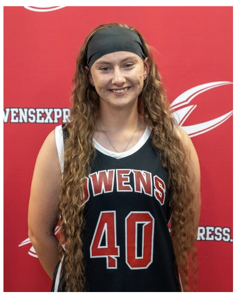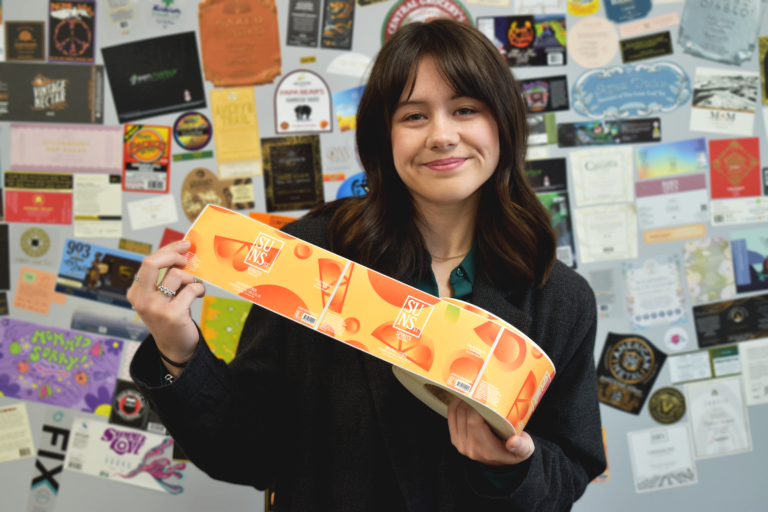
Victoria Leu with her winning label designs!
Interview prepared and submitted by Brittany Mihalec, Grace Imaging
Victoria’s Mosaic Vision: Exclusive Interview Questions Answered
From a myriad of entries, Victoria Leu’s creation emerged as the epitome of ingenuity, seamlessly blending digital art with a retro twist. She is currently pursuing a major in Visual Communication Technology at Owens Community College and is expecting to graduate with her associate’s degree in the spring of 2024. In a Q&A, Victoria Leu shares insights on the creation of her mosaic design.
- What inspired the design concept and choice of colors and patterns for the mosaic label design?
“I, of course, am always keeping an eye out for inspiration, even when I am not working on a specific design. Walking through the grocery store and judging designs is one of my favorite hobbies. It is silly, but it is also refreshing! Once I chose orange as the flavor, I could draw from the colors and very simple shapes of the fruit. My inspiration was to build the design from simple shapes, using gradients to give it an interesting look. That led me to want to keep the logo very basic against the busy pattern. I was also trying to consider it being repeated and how each shape would look, whether turned, upside down, or in a different direction. You also get a sense of the flavor as soon as your eye hits the can! I have been attempting to build shapes and go back to the basics, rather than take too many ideas from outside references, to keep it authentic.”
- Can you share the creative process behind developing the winning design?
“My creative process always starts from the same place: of brainstorming and sketching in my little red sketchbook. With this design, my idea really took off without many roadblocks. I eventually did a lot of scrolling on the web when it came to the text on bottle packaging.”
- Were there any specific challenges faced during the design process, and how were they overcome?
“The challenges I recognized as designing were how I could easily stray from alcohol branding into just a wacky design. There are so many new innovative package designs now that don’t stay restricted to a genre. I didn’t want to get carried away! With the whole pattern itself, that was something new, putting together a layout. I was learning the best way to go about that, working from the outside in on the artboard.”
- How do you envision the mosaic label resonating with consumers or standing out on the shelves?
“I think the vibrancy of the colors is what will make it stand out on the shelf. The color is very warm and enticing. I also think it does not have too many. The limited color palette emphasizes the orange flavor.”
- Were there alternative design concepts considered before settling on the mosaic theme?
“I tossed around a few other flavor ideas, but once I settled on orange citrus, I knew the direction the design would go in. I considered giving it a more luxurious feel. I also considered that if there were to be more flavors, if it were a real brand, how would those other flavors have the same style while having a different pattern? This pattern design, I feel, could be replicated for other flavors, giving it flexibility.”
- What did you enjoy the most about this contest?
“I enjoyed learning! Every contest, project, or collaboration is a chance to do something different. Working with Brittany Mihalec was amazing and eye-opening. It really solidified that this is the line of work I want to be in!”
- Tell us about your creative self and what made you pursue a career in graphic design.
“I have always been creative and art-driven since I was small! My grandma always found a way to make anything creative, so I must get it from her. Design has become involved in every aspect of my life. Painting is a big hobby of mine and a big part of who I am, but graphic design is my passion and my career. After learning what graphic design truly was, I was able to understand the career I could make for myself. I am so happy to have a career that is so creative!”

